
To use the song choices we had decided on we had to get permission from the record labels. So Michaela emailed EMI records asking and this is the email she recieved.

This screeshot shows our final graphics we have decided to go for a purple in a white outline so it is easy to read. Here are the first trys also.

For our first attempt we decided to use a banner to overlay the grpahics on top however we felt it was to distarcting so we carried on trying.
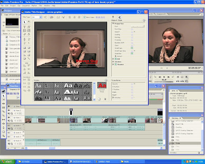
 This screenshot shows our second attempt. We like the colour puprle and think it fits in well however it is hard to read so we will develope this further.

 This screenshot shows our second attempt. We like the colour puprle and think it fits in well however it is hard to read so we will develope this further.
We tried a chunkier text and a darker colour however we felt this looked to childish.

This screenshot shows use changing the audio. We used audio transtions to fade music in and out and also adjust the sound levels so every thing was clear and easy to hear
 This screenshot shows rendering clips. We had to render clips as we had sped up and slowed up the duration of some fotage which meant it didnt flow as smoothly.

This screenshot shows use changing the audio. We used audio transtions to fade music in and out and also adjust the sound levels so every thing was clear and easy to hear
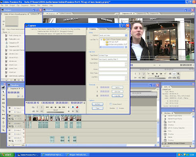
This screenshot shows us capturing our footage from the tape to the pc.
No comments:
Post a Comment